Building a Design System from the Ground Up
Role: Design Team Lead
Design Infrastructure for a Federal Design Team
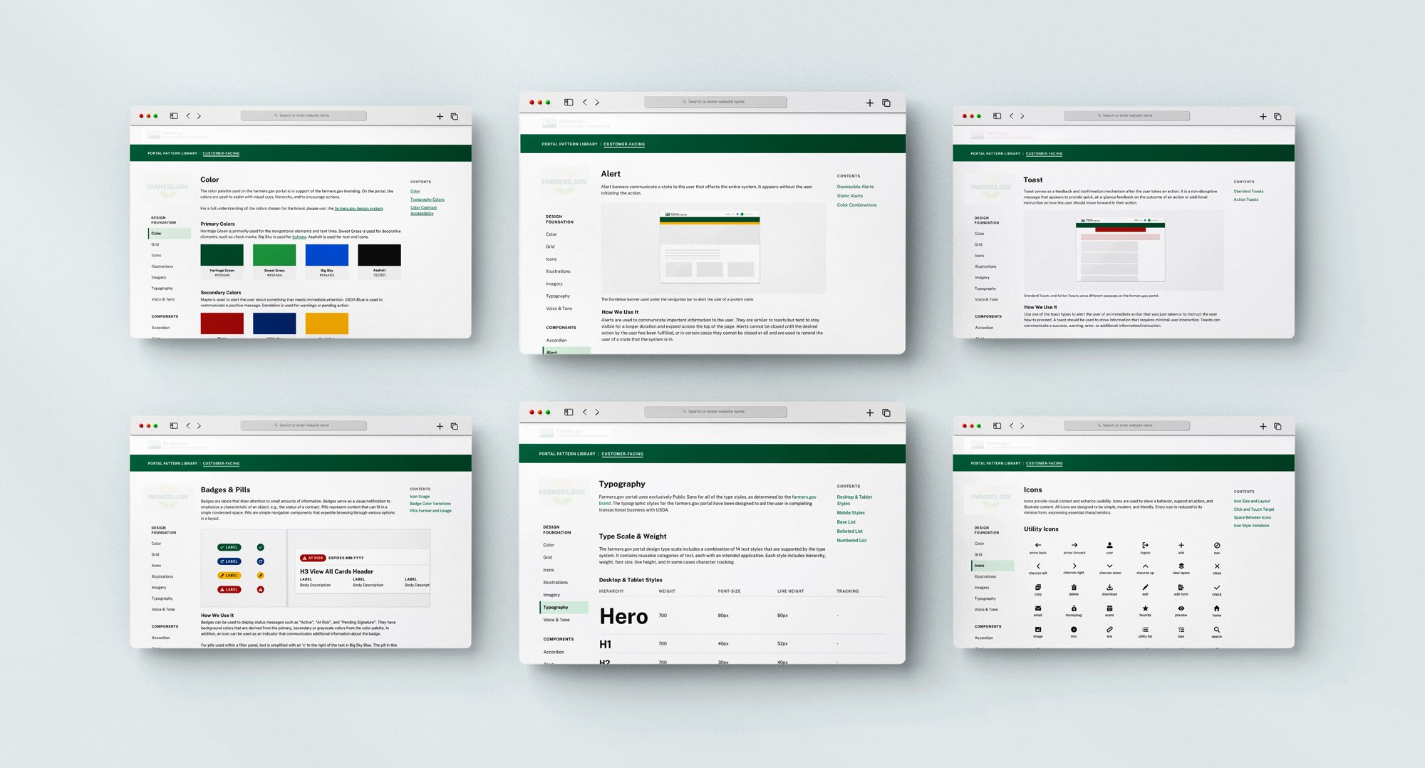
As team lead, I created and launched an enterprise design system for a federal client running on Salesforce — consolidating the work of four design teams and five development teams on a single agile release train into one component library. I led the information architecture, authored all 30 component library pages, and presented the system's plan and results directly to product owners, business owners, and development, architecture, and systems teams during PI Planning.
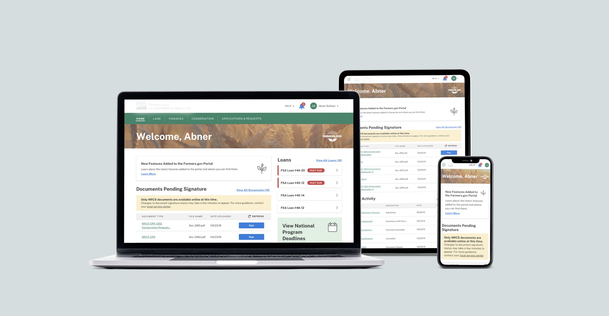
Due to contractual requirements, this work cannot be shown in full detail.
My Contribution
Systems Strategy
User Research
Product Design
The Team
5 + Development Teams
9+ Designers
10+ Engineers
Year
2021
Context & Problem
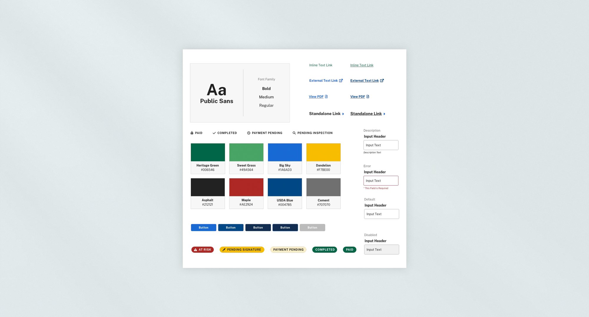
Four design teams and five development teams were shipping features on the same agile release train — which meant every team was making its own small decisions about how a button, a form field, or a page layout should look and behave. None of those decisions were wrong individually, but multiplied across nine teams, they added up to design debt: the same component reinvented slightly differently by each team, inconsistency that compounded release over release, and no shared reference either designers or developers could point to and say "build it like this."
The system also had to work within two existing constraints rather than starting from a blank page: it needed to stay true to the client's existing brand guidelines, while conforming to the structural and technical standards of Salesforce Lightning, the platform the portal was built on. So the problem wasn't just "there's no design system" — it was "build a single, consistent source of truth that nine teams can actually use, without contradicting either the brand or the platform it has to run on."
Research & Insights
The starting point was a cross-comparison of the client's existing brand guidelines against the Salesforce Lightning design system — mapping where the two aligned, where they conflicted, and where gaps existed that neither one addressed. That comparison became the foundation for the information architecture: which components needed to exist, how they should be categorized, and what "consolidated into a uniform, singular library" actually meant in practice for this specific portal.
The key insight was that a design system for this environment couldn't be documentation-only — 508 accessibility, responsiveness, and interactive states needed to be specified precisely enough that developers could build directly from the spec, not interpret it. That shaped every component page that followed: each one had to answer not just "what does this look like" but "how exactly do you build and use it correctly."
Design Process & Key Decisions
Information architecture first. Before building any individual component, the brand-vs-Lightning comparison was translated into an IA — a defined structure for how components would be categorized and how the library as a whole would be organized, so 30 individual pages would add up to one coherent system rather than 30 disconnected references.
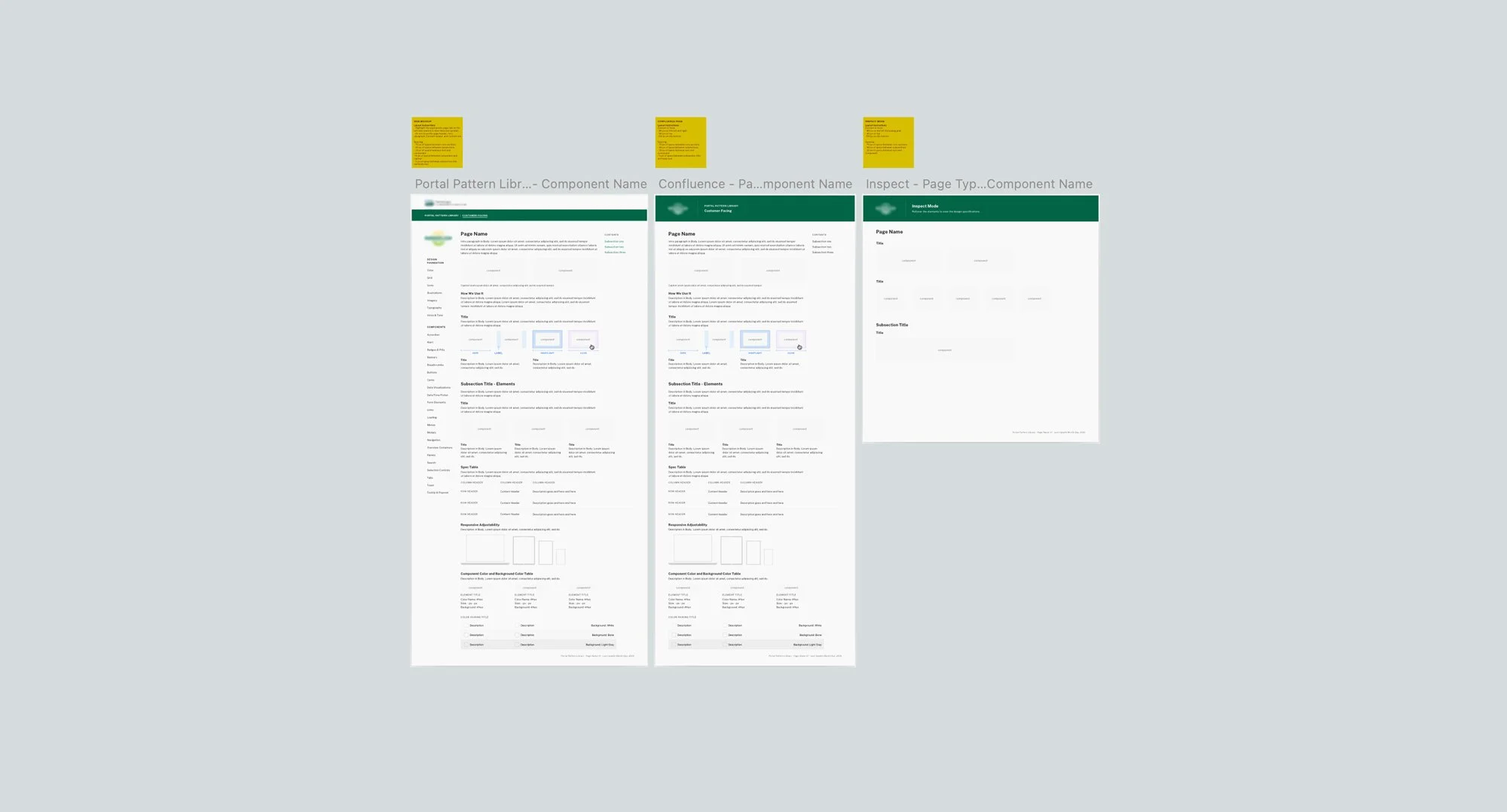
A consistent template for every component page. Each of the 30 component library pages followed the same structure: a written description of the component, how and when to use it, general rules and use cases, related components in its category, and full specifications — placement, responsiveness, spacing, size variations, interactive states, and 508 accessibility. That consistency meant any designer or developer on any of the nine teams could find what they needed the same way, every time, regardless of which component they were looking up.
Built for the tools teams actually used. Shareable exports were created in Sketch for InVision, Abstract, and Jira — meeting designers and developers where their existing workflows already lived, rather than asking nine teams to adopt a new tool just to reference the system.
The Outcome
For applicants:
One uniform, singular component library replacing nine teams' worth of inconsistent, one-off decisions
A regular feedback cadence kept specifications current, rather than letting the system go stale as the portal evolved
Design system ownership successfully transitioned to other visual designers through direct mentorship — the system outlived your individual involvement
For stakeholders:
30 component library pages released to the agile release train, covering four design teams and five development teams
A dedicated Sketch/Abstract symbol library gave the internal design team a consistent, reusable working environment
Presented and validated directly with product owners, business owners, and development, architecture, and systems teams during PI Planning — cross-functional buy-in at the program level, not just within the design team
Leadership & Collaboration
Managed every page from design through release, reviewing each of the 30 component pages before it shipped to the library — not just producing the content, but owning its quality end to end.
Sustained a regular maintenance and feedback cadence with both design and development teams, keeping specifications up to date as the portal and its nine teams continued to evolve — this wasn't a launch-and-walk-away deliverable.
Presented the system's plan and results at PI Planning to product owners, business owners, development teams, architecture teams, and systems teams — meaning you were the one translating design decisions into terms that landed with five distinct, non-design stakeholder groups at once.
Created and managed a Sketch and Abstract symbol library for the internal design team's use, extending the system's consistency into the design team's own working files, not just the shipped product.
Mentored visual designers into taking ownership of the system's component management — the clearest evidence that this was leadership, not just execution: you built something, then developed the people who kept it going after you.